

Most post-event reports read like a victory lap. Big registration number at the top, a healthy attendance rate, a few kind words from the feedback survey, and everyone moves on to the next event. The problem is that none of those figures tell you what actually happened in the room, or what you should do differently next time.
Event data is not short of numbers. It is short of meaning. The organisations that consistently improve are the ones that treat analytics as a decision-making tool rather than a scoreboard. Here is how to do that.
Why do most event reports fail to tell you anything useful?
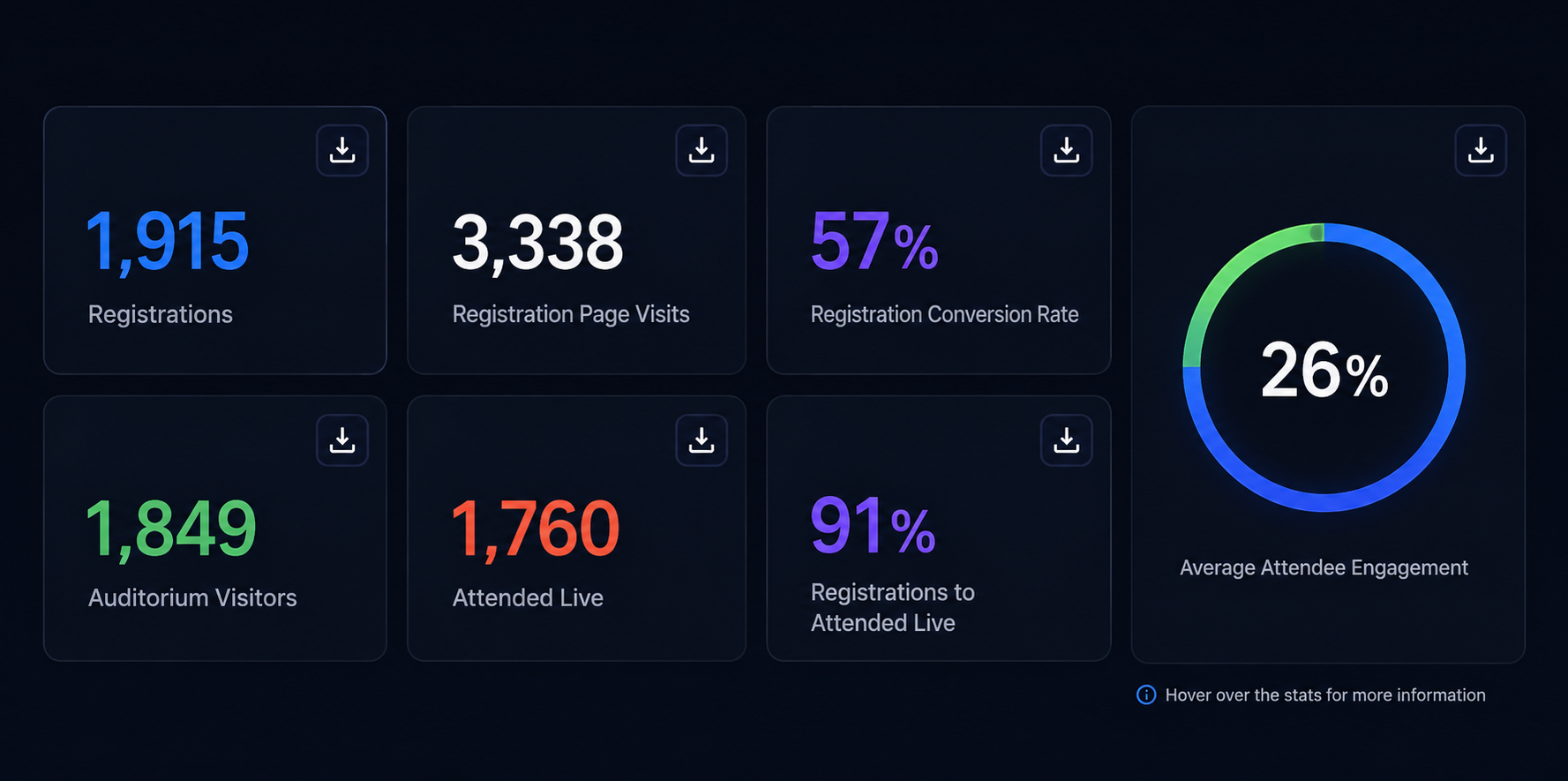
Because they measure the easy things. Registrations, attendees and average dwell time are simple to pull and simple to present, so they dominate the report. But they answer the wrong question. They tell you how many people showed up, not whether the event worked.
A useful report answers three questions instead. Did the right people attend? Were they genuinely engaged, or just logged in? And did the event move them closer to a decision? If your current reporting cannot answer those, you are measuring activity, not impact.
Start by separating your metrics into two buckets. Vanity metrics look good in a slide but change no behaviour. Decision metrics tell you what to do next. A 60 percent attendance rate is a vanity metric on its own. The same figure, broken down by acquisition source so you can see which channels bring people who actually turn up, is a decision metric.
What engagement data should you actually be tracking?
.png?width=1280&height=720&name=Business%20Back%20to%20Back%20Guest%20Speaker%20Collab%20YouTube%20Thumbnail%20(3).png)
Attendance gets someone through the door. Engagement tells you whether they stayed for a reason. This is where the richest and most overlooked data sits.
The signals worth capturing include:
- Watch time and drop-off points. A sharp fall at the 12-minute mark is a content problem you can fix, not a mystery. Map drop-off against your run of show and you will see exactly which segments lose people.
- Interaction depth. Poll responses, questions asked, resources downloaded and reactions all indicate active rather than passive viewing. Someone who asks a question is worth more to your follow-up than ten silent attendees.
- Return behaviour. For on-demand and series content, whether people come back is one of the strongest indicators of value.
The point of tracking engagement is not to admire it. It is to act on it. If a particular segment consistently drives questions, that is your next webinar topic. If interactive polls lift watch time by several minutes, build more of them into your format. Engagement data is a live brief for your next event.
How do you compare performance across multiple events?
One event tells you a story. A portfolio tells you the truth. Cross-event analytics is where individual results become patterns you can rely on.
To compare fairly, you need consistency. Track the same core metrics the same way across every event, so a webinar in March is genuinely comparable to a virtual summit in September. Without that discipline, you are comparing anecdotes.
Once your data is consistent, look for portfolio-level trends. Which formats produce the highest quality engagement, not just the biggest audiences? Which topics reliably convert? Which times and days perform best for your specific audience, rather than a generic industry benchmark? The best moment to host may well differ for a technical audience in one region and a commercial audience in another, and only your own cross-event data will reveal it.
Cross-event analysis also protects you from overreacting to a single result. A disappointing turnout for one webinar might be a bad slot, a competing event or a weak subject line. See the same dip across five events and you have a real problem to solve. Context turns noise into signal.
How do you connect event data to business outcomes?
This is the step most teams skip, and it is the one that earns your programme its budget. Engagement is a means, not an end. The final question is always whether the event contributed to a business result.
Tie your event data to what happens afterwards. Which attendees progressed to a meeting, a trial or a purchase? Which engagement behaviours predicted that progression? You will often find that a handful of specific actions, such as attending live rather than on-demand, or downloading a particular resource, correlate strongly with pipeline. Those become your qualifying signals.
Do this consistently and you can start attributing revenue influence to events with confidence, rather than defending them on gut feel. You also learn where to spend. If interactive live sessions produce better downstream outcomes than passive broadcasts, that is where your effort should go.
Turning data into a habit
The teams that get the most from event analytics are not the ones with the fanciest dashboards. They are the ones who look at the same handful of decision metrics after every event and ask a simple question: what will we do differently next time?
Build a short, repeatable report. Lead with engagement and outcome metrics, not headline attendance. Compare against your own portfolio, not vanity benchmarks. And close every report with a decision, not a summary.
WorkCast brings your registration, live engagement and on-demand data together in one place, so you can see the full picture across a single event or your entire portfolio without stitching spreadsheets. If you are ready to move from reporting numbers to acting on them, that is a good place to start.
.png?width=2380&height=2380&name=%E2%80%9CClick%20here%E2%80%9D%20to%20view%20our%20open%20uni%20handbook%20(1).png)
Share this
Event Data Analytics: Turning Attendance Into Actual Insight
Why Publishers Should Re-Sell Their Online Events Platform
